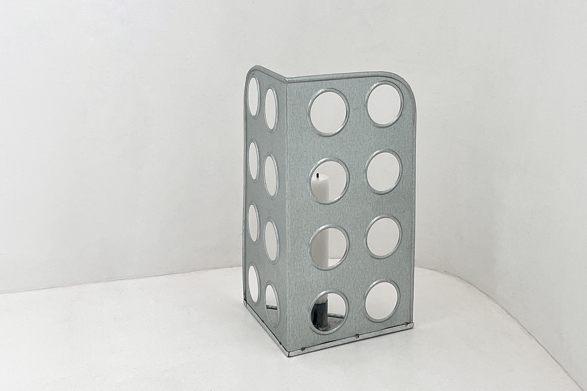
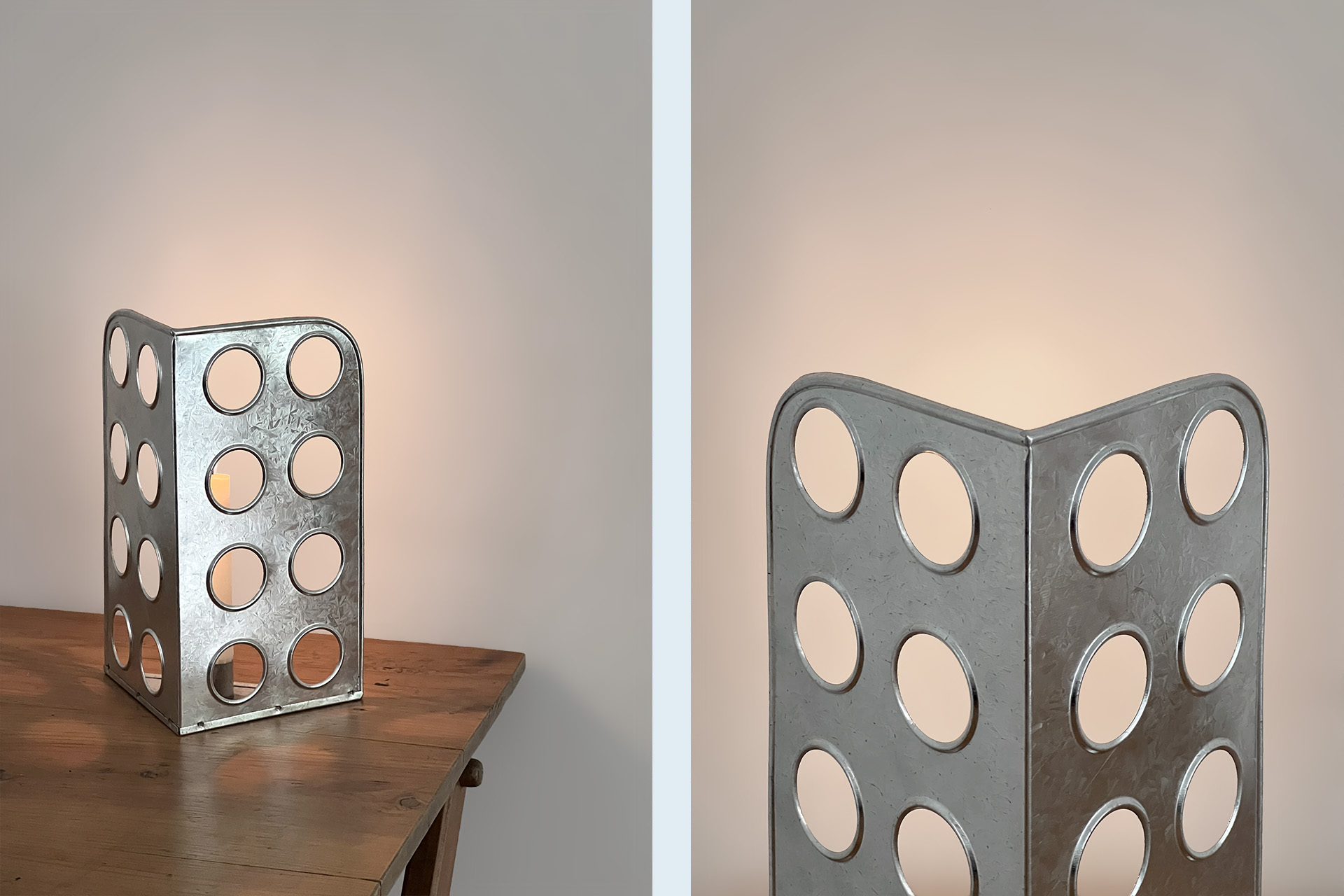
LATA CANDLE HOLDER
The Lata Candle Holder is an exploration of Latoaria, the traditional Portuguese craft of tin sheet metalwork, which transforms flat metal sheets into three-dimensional objects using simple, time-honored techniques.
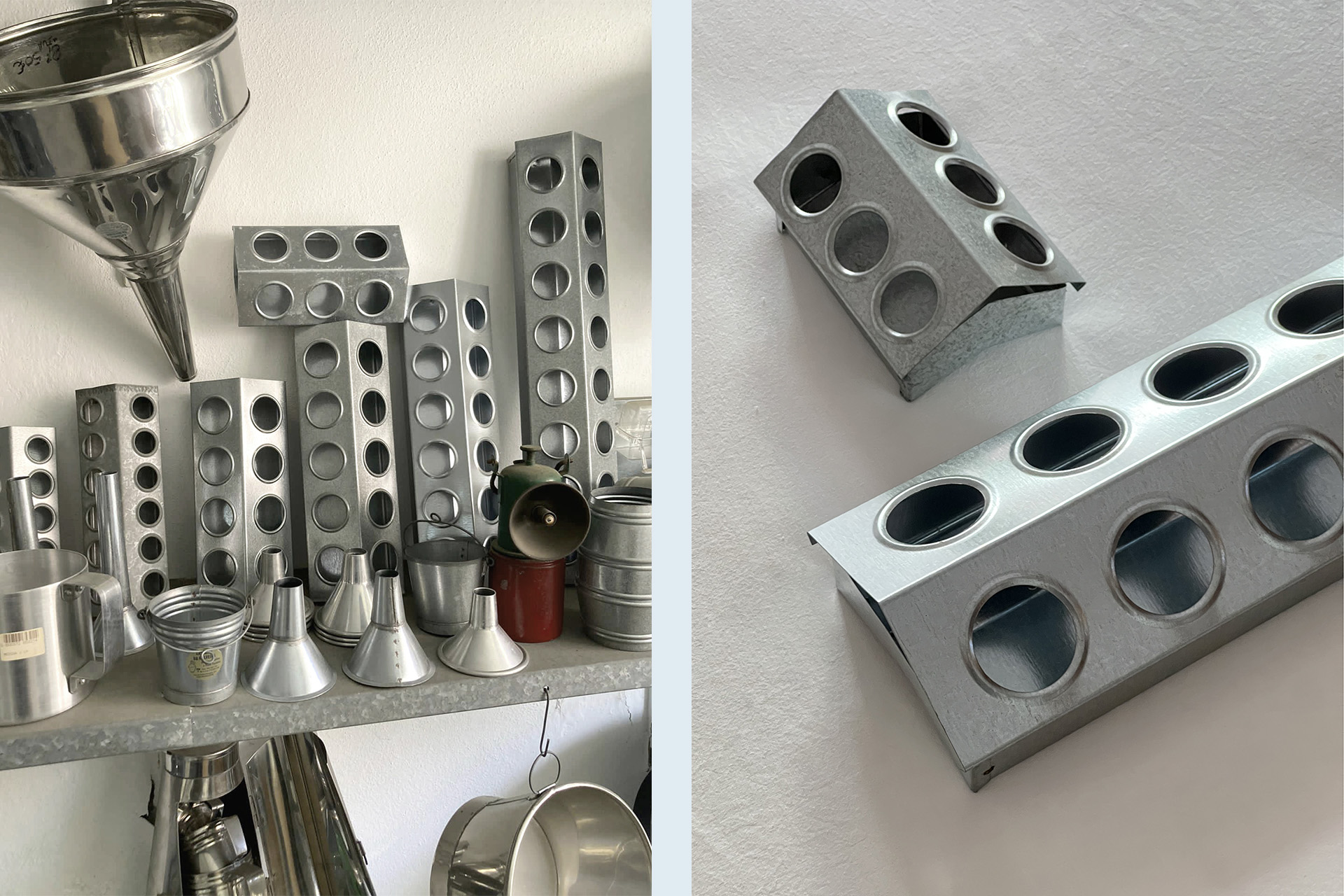
This project was developed in collaboration with a workshop near Lisbon, where I was initially struck by the ingenuity of traditional chicken feeders. Their stamped perforations—designed to prevent birds from injuring their beaks—demonstrated an elegant balance between functionality and material efficiency.
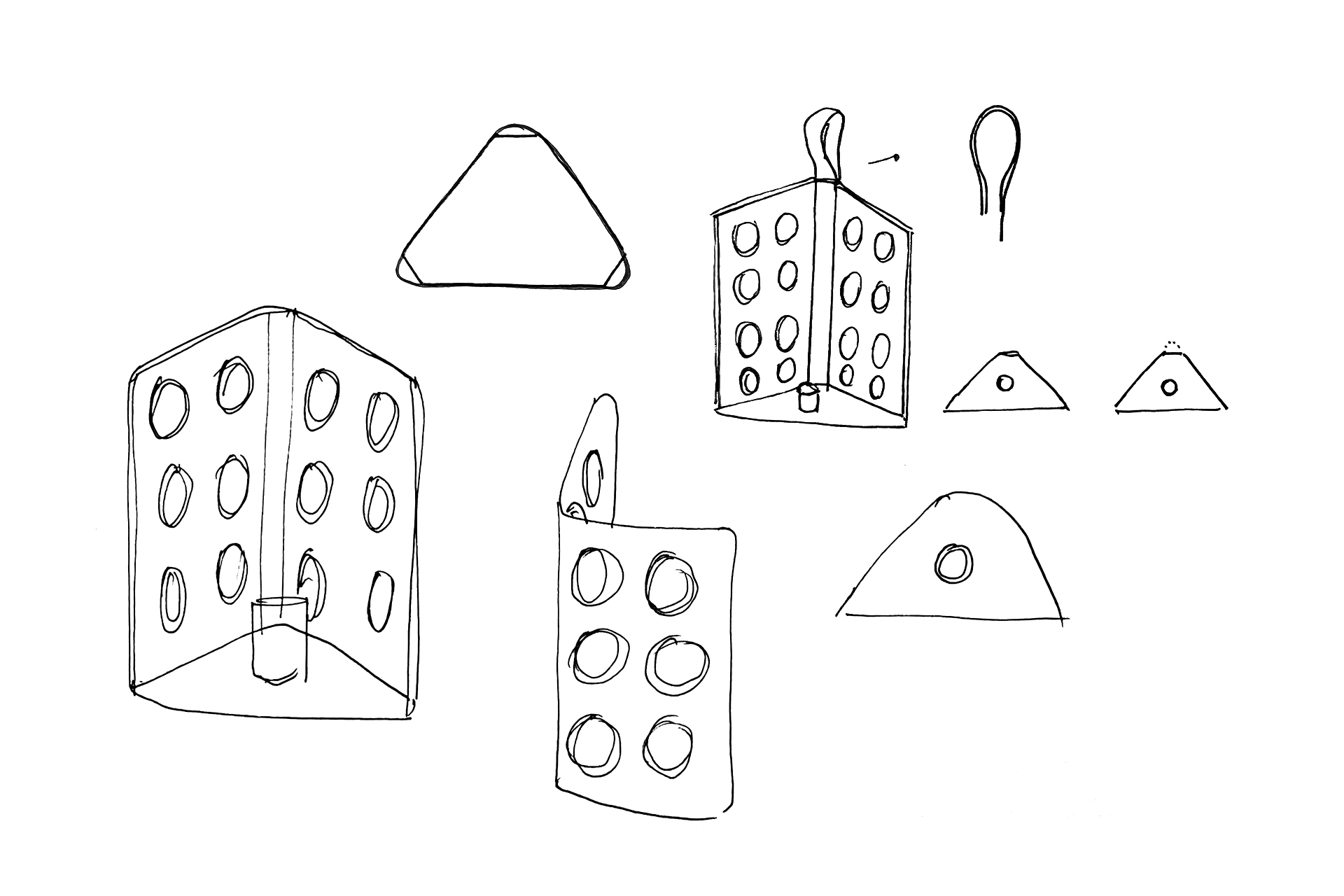
Recognizing the potential of this detail beyond its original use, I sought to reinterpret the perforated pattern within a new typology. A candle holder emerged as a natural choice, allowing the perforations to create a dynamic interplay of light and shadow while enhancing the reflective qualities of the tin.

The making process combined existing workshop tools with additional tin-rolling techniques developed specifically for this project. Although a precise two-dimensional drawing guided the initial design, many aspects of the final form were shaped through the craftspeople’s deep material knowledge and hands-on expertise, resulting in an object that reflects both intentional design and the inherent logic of the craft.
2025 // Open for edition.
Photos by Pereira Office

BARRO COLLECTION NEW COLORS
Barro is a tableware collection that brings the warmth and beautiful simplicity of terracotta to the table. Barro, which means ’red clay’ in Portuguese, was created as a tribute to the country’s craftsmanship traditions.
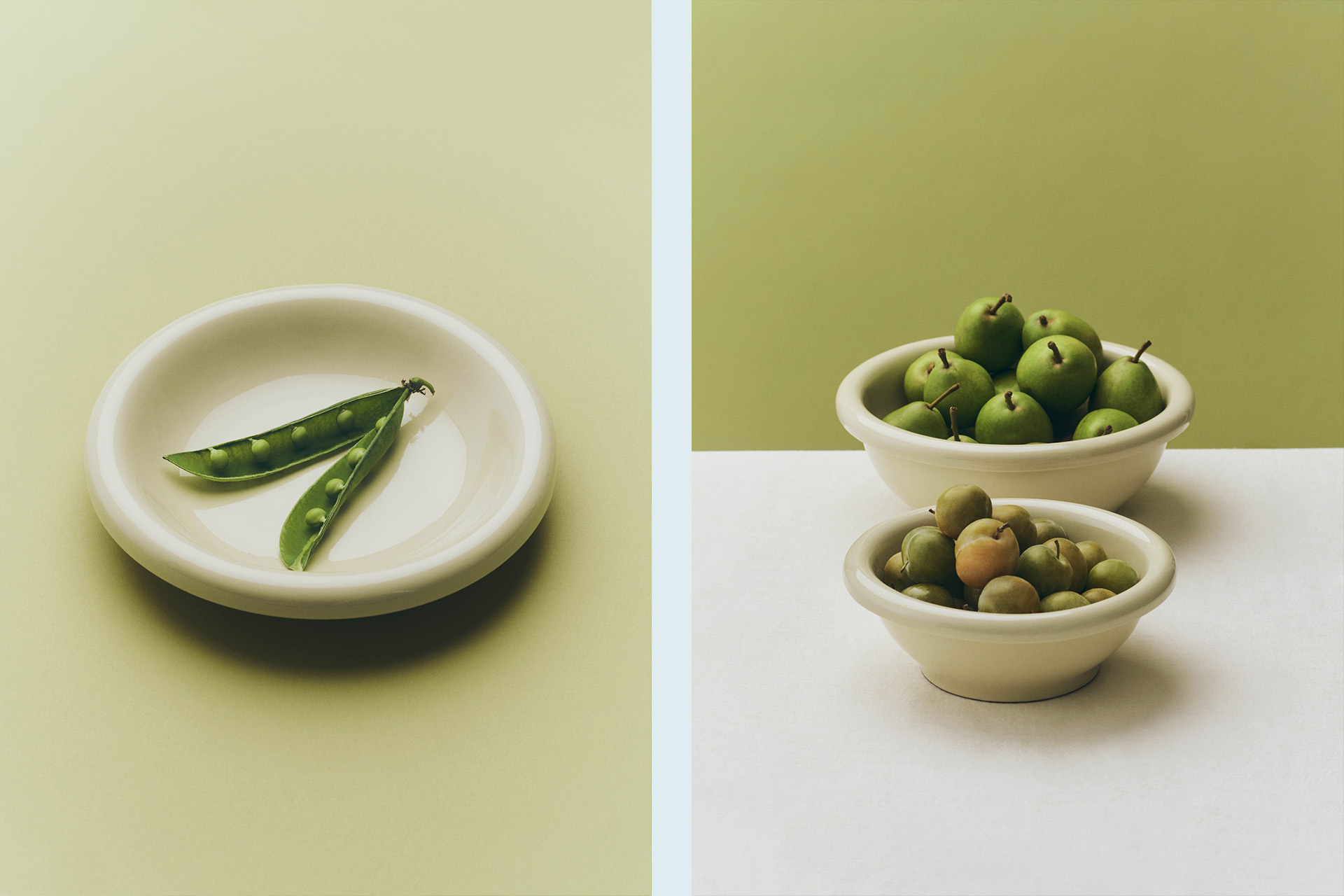
Burgundy and Pistachio have been newly introduced to the range, with existing colours also expanded across additional typologies.


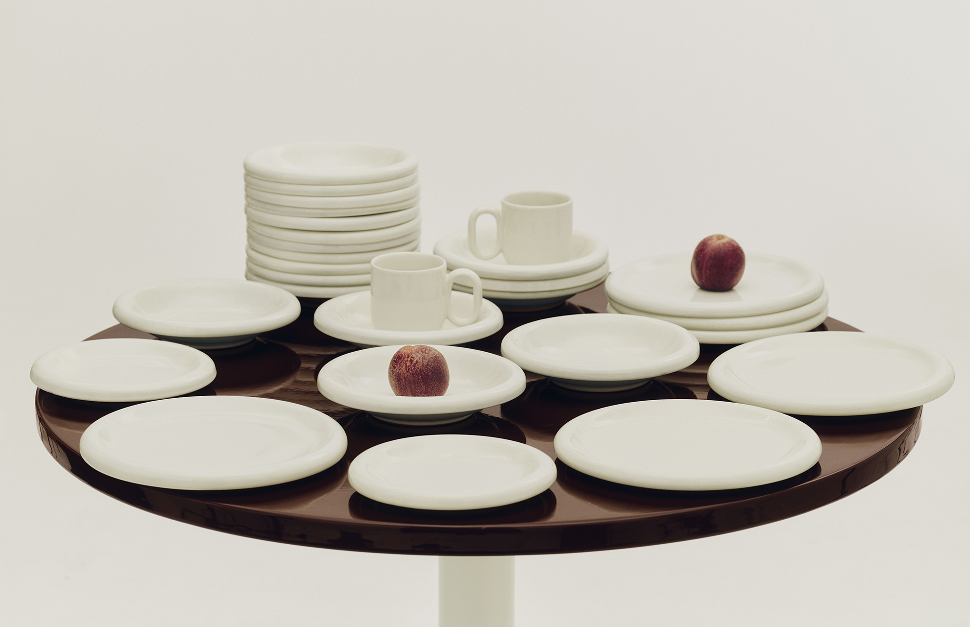


2026 // Produced by HAY
Photos courtesy of HAY

ULTRASUEDE SHOWROOM
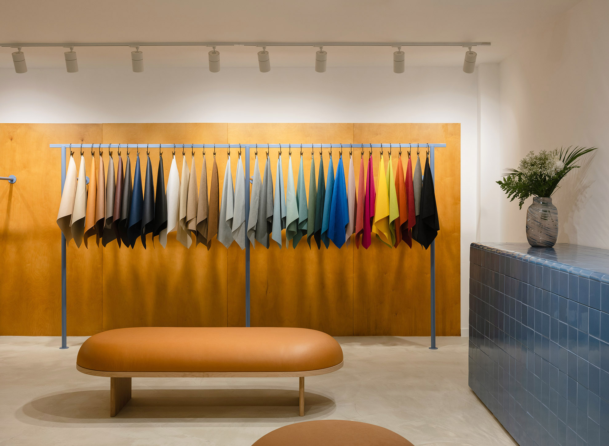
Japanese materials group Toray commissioned designers Ryosuke Fukusada and Rui Pereira to create their first Europe-based showroom, located in Sintra, near Lisbon, Portugal. The brief called for an immersive environment for Ultrasuede, Toray’s premium suede-alternative material.
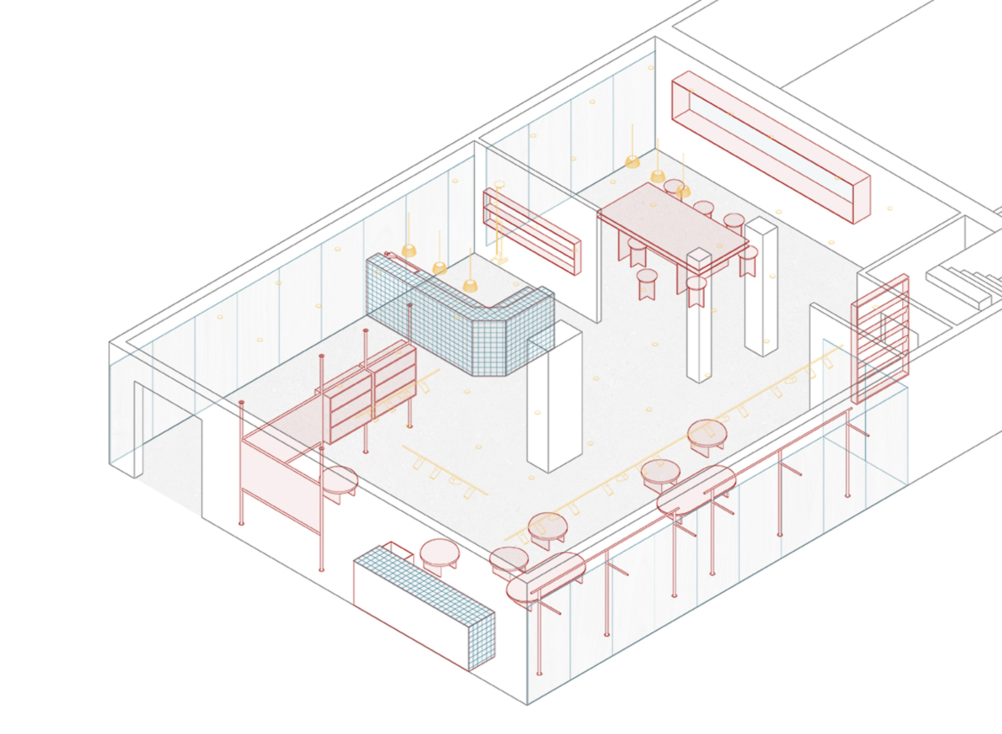
The primary challenge was to establish a calm, refined brand experience within an active sewing factory with no outward-facing windows. The designers identified an opportunity to develop an interior that contrasts with the industrial surroundings—an environment that encourages creative exploration and direct engagement with the materials on display.
The spatial concept draws heavily from the context. The team envisioned a transitional threshold between factory and showroom, referencing French mid-century structural aesthetics and the warmth of stained birch plywood cladding. This combination creates a controlled, serene atmosphere that anchors the brand narrative.
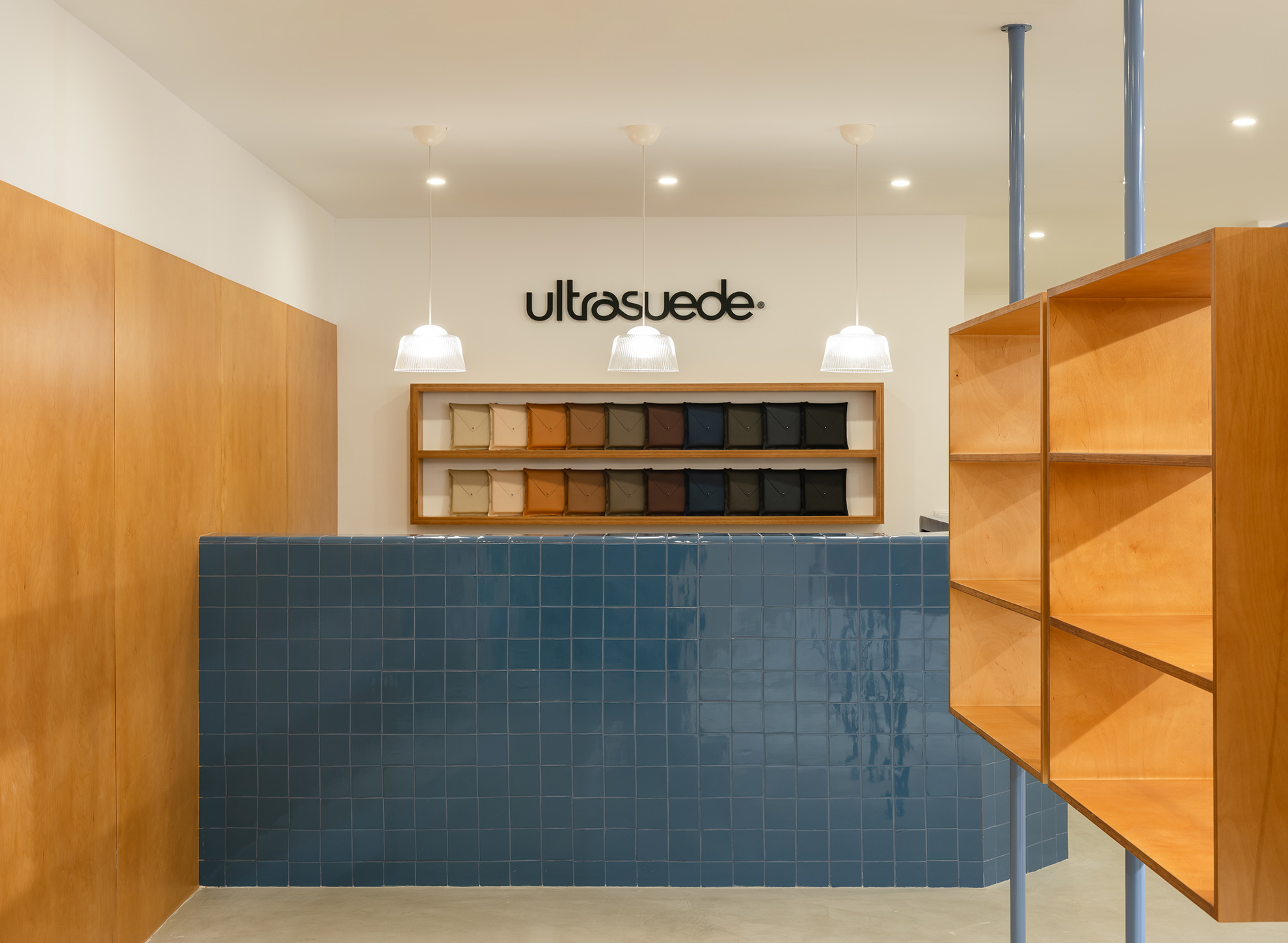
A key feature celebrating the showroom’s Sintra location is the integration of ceramic tiles by Viúva Lamego, one of Portugal’s oldest manufacturers of handmade ceramics. The reception counter, sampling console, and bathroom surfaces are finished in 10 × 10 cm high-gloss blue glazed terracotta tiles, providing a chromatic and textural counterpoint to the micro-cement flooring, birch-clad walls, and exposed steel elements.
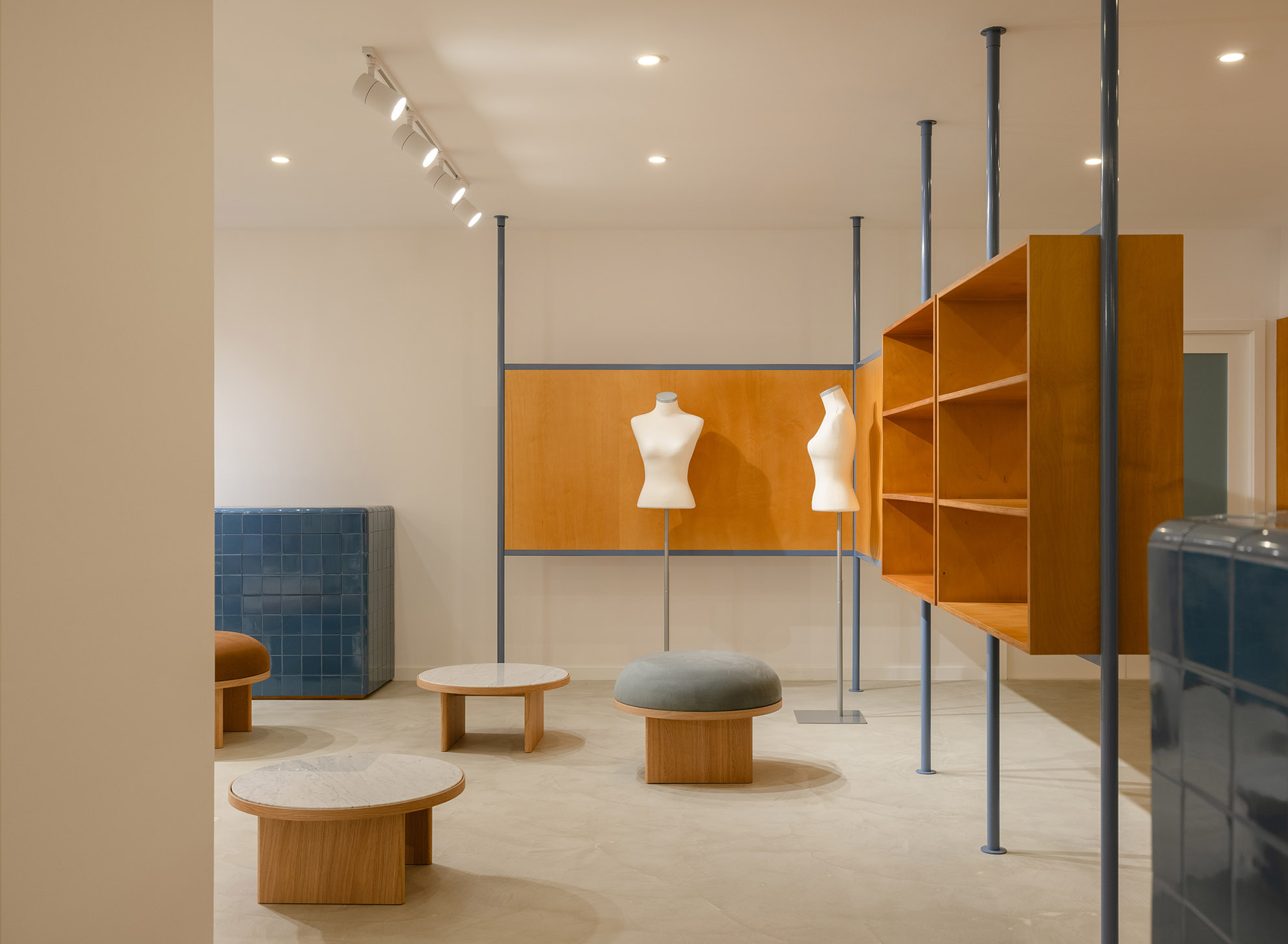
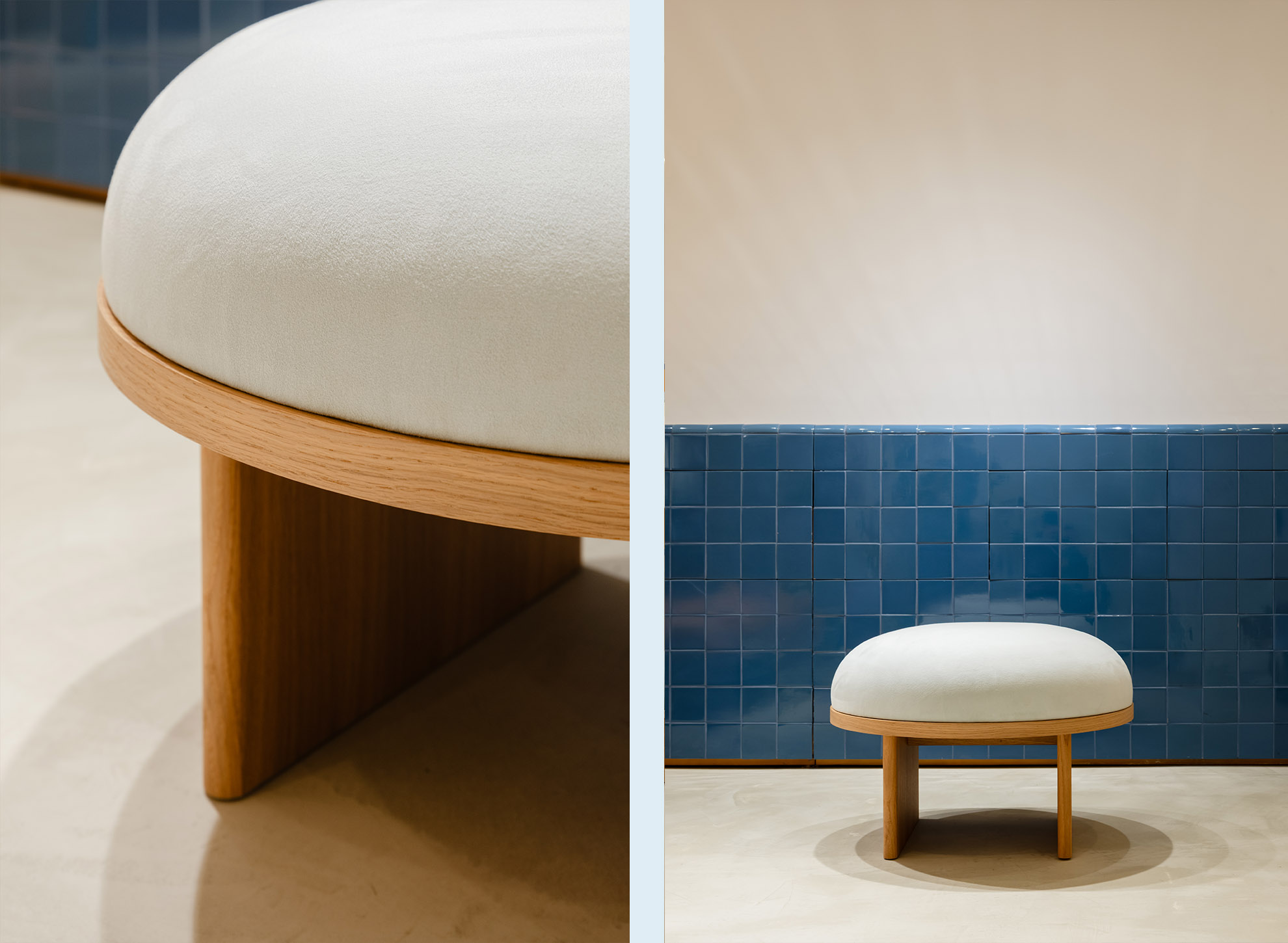
To display the extensive range of Ultrasuede colours and fabrication possibilities, two custom wall-mounted display racks serve as the central focal points of the room. Adjacent to these racks, a lounge area furnished with Anza stools, benches, and coffee tables enables tactile interaction with the materials. The tiled console incorporates four large drawers for storing samples, prototypes, and mock-ups. Two mannequins further illustrate the textile’s potential for apparel applications.
To introduce natural visual depth and increase spatial openness, the designers cut a large interior window into the warehouse wall, visually connecting the meeting area to Toray’s stockroom. This meeting zone includes a custom conference table and upholstered stools featuring various Ultrasuede colours and finishes.
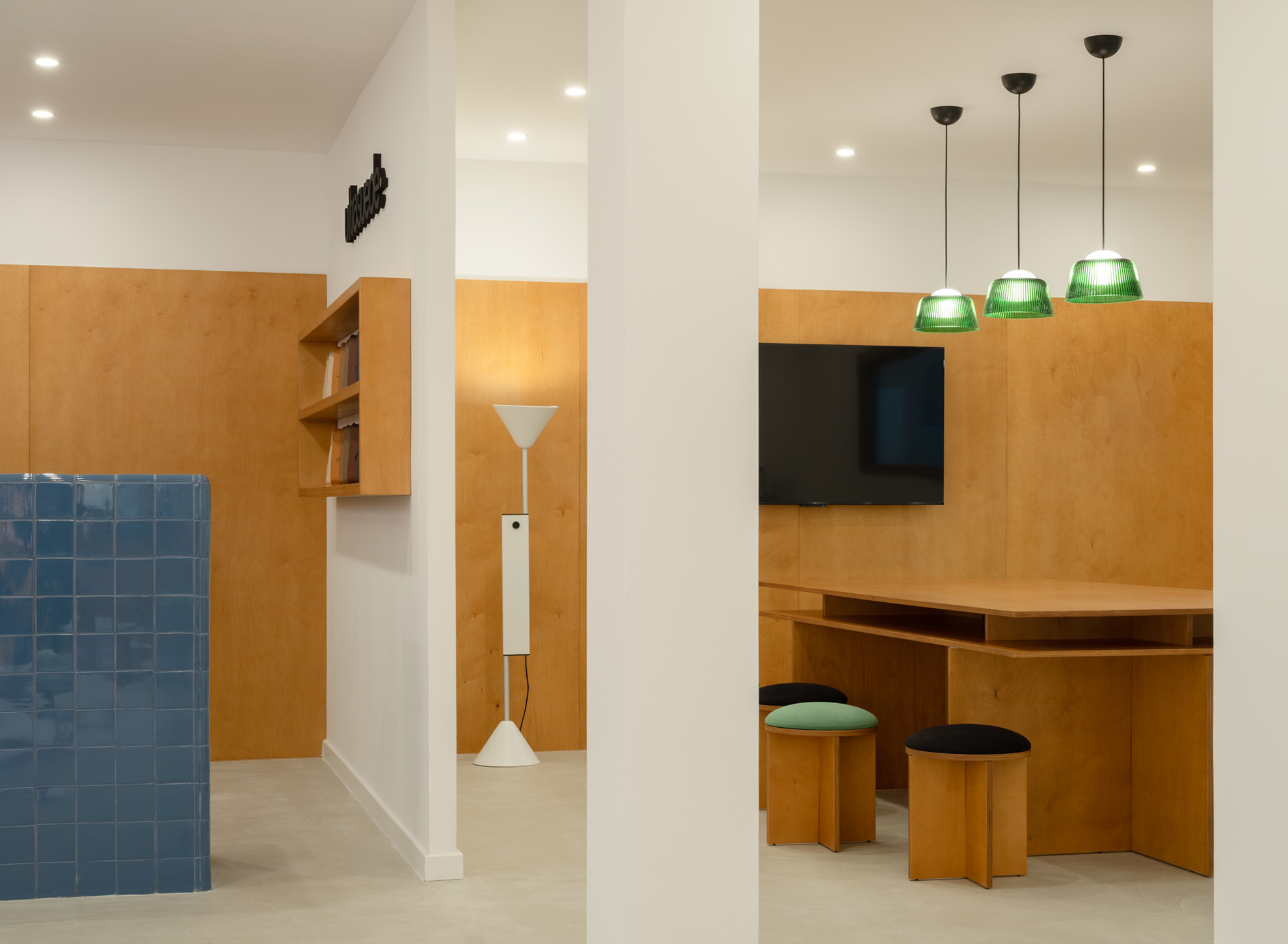
An industrial sewing machine was integrated into the showroom to facilitate rapid sampling, demonstrations, and on-site experimentation with the material.
When the showroom doors are closed, the space becomes acoustically and visually insulated from the factory environment. It is transformed into a softly illuminated, warm interior atmosphere defined by birch wood surfaces, upholstered elements, and the tactile richness of the Ultrasuede collection—effectively concealing the industrial context outside and immersing visitors in the brand’s material universe.

2025 // Commission by Toray group.
Designer in collaboration with Ryosuke Fukusada.
Photos by Francisco Ascensão

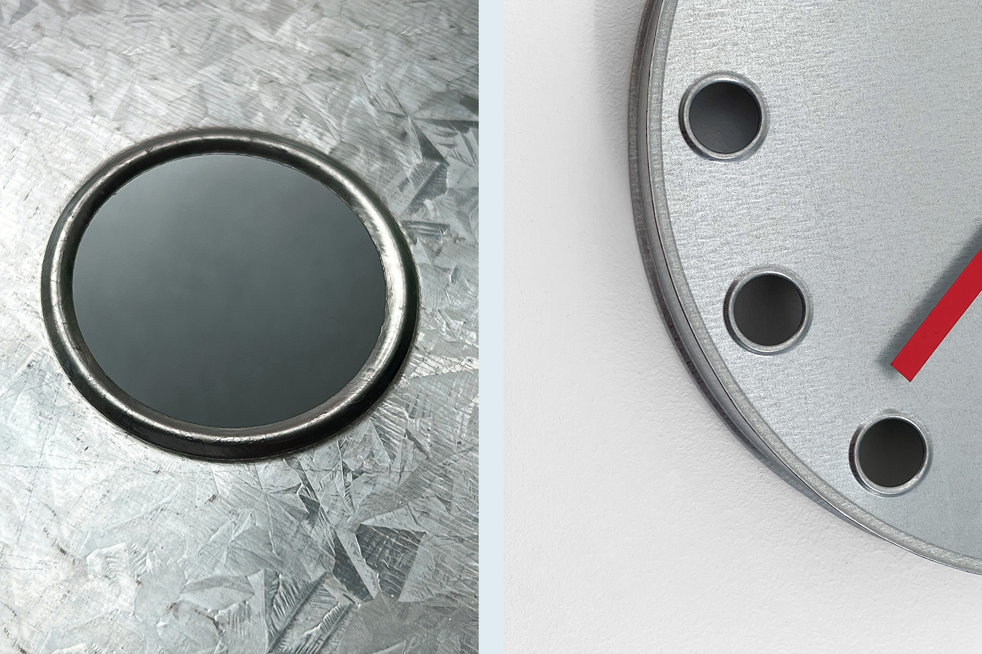
TIN TIME WALL CLOCK
Tin Time is an exploration of the traditional Portuguese tin sheet craft known as Latoaria, which transforms flat sheet metal into three-dimensional products using simple techniques. For this project, I collaborated with a workshop near Lisbon, where I was first struck by the simplicity and ingenuity of chicken feeders featuring stamped holes to prevent the birds from harming their beaks.
I saw an opportunity to incorporate such holes into the clock design as a way to mark the passage of time. The process combined these existing tools with additional tin-rolling techniques.

While a precise 2D drawing was provided, many details were shaped by the craftsmans’ expertise with the material.
In contrast to the galvanized tin surface, the clock hands are enamelled for a subtle finish. A standard quartz mechanism powers the timepiece.

2025 // Commission for ‘24 Hours’ Exhibition
A project curated by Jamie Wolfond Studio. Creative and communication consulting by Simple Flair. Milan Design Week 2025
Photos by Pereira Office

BRIM GLASS PENDANT
Designed for HAY in collaboration with Ryosuke Fukusada, Brim draws inspiration from the classic glass pendants found in 'tascas,' 'trattorias,' and 'bodegas' worldwide. Our fascination with the precision and detailed definition offered by pressed glass led us to design a fluted pattern that enhances light diffusion, facilitating its even and soft spread.
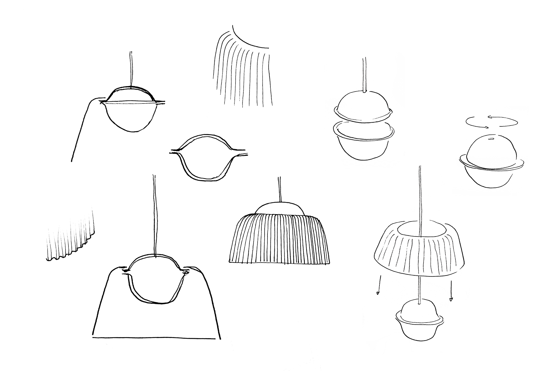
For the light source, with the intention of eliminating any visible light bulbs, we developed an injection-molded plastic sphere. This sphere not only houses the two light bulbs (please consult development for the exact bulb type) but also features a perimeter brim used to support the lampshade—a detail that defines the product's name.

The light source not only provides the surface below with generous diffuse light but also emits a soft indirect light upwards, creating a calm and inviting environment. Utilizing pressed glass enables us to achieve a well-balanced shade with a distinctive silhouette at a competitive price, in line with the brand's democratic values.

This compact pendant lamp, designed to be used in clusters, also works exceptionally well in smaller spaces such as hallways, dining sets, over counters, or in a linear configuration. Inspired by apothecary containers, three glass colors were carefully chosen for the shade: clear, green, and grey—tones intended to complement various environments and moods.
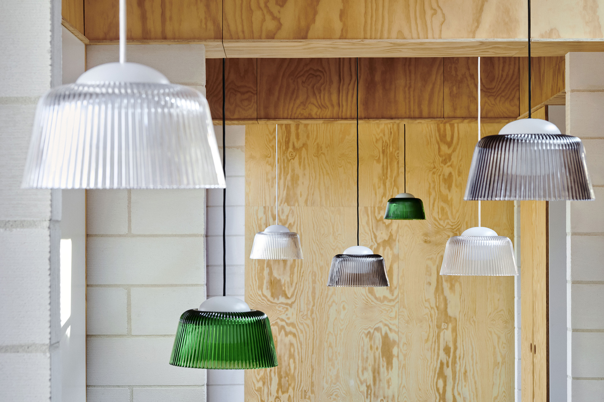
This lamp updates a typology that is very know to us all with a new materiality and upwards ambient light, making it suitable for all kinds of environments.

It was designed for disassembly, allowing all components to be taken apart and recycled at the end of its life. The materials used were selected to ensure a long-lasting and durable product that can gracefully withstand the passage of time.

The purity of the light source, combined with the delicate fluted pattern featured in the glass shade, imparts the lamp with a recognisable yet neutral feel, hopefully turning it into a timeless piece.
2024 // In collaboration with Ryosuke Fukusada. Produced by HAY
Photos courtesy of HAY