NEWS

12.06.2024 / BRIM GLASS PENDANT, designed in collaboration with Ryosuke Fukusada for Danish brand HAY, will be previewed next week during 3 Days of Design in Copenhagen.
Find more at BRIM GLASS PENDANT

11.06.2024 / Our ANZA COLLECTION, designed in collaboration with Ryosuke Fukusada, is part of ‘Sketches of Seating’ - Exploring the creative and sketching process of 32 international designers.
Book project by Rhys Kearns and Daniel Schofield studio
Words by Leanne Cloudsdale
Printed by Graphic unit
Available for purchase on Tuesday, June 11th 2024 at the release event at Andra Eatery in Copenhagen and online soon after.All profits from this first launch will go to Natur Fonden.
Image courtesy of Direction Bureaux

12.02.2024 / KAWARA OBJECTS at ALCOVA.
NEW ceramic objects presented at ALCOVA during MILAN DESIGN WEEK 2024.
PRACTICAL INFORMATION
Venue: Room0.BV4 / Villa Bagatti Valsecchi, Via Vittorio Emanuele II, 48, 20814 Varedo
Date: 15(Mon) – 21(Sun) April, 2024
Hours: 11:00 – 19:00 (Last entry at 18:00)
Press preview: 14(Sun) April This preview is reserved for journalists only.
Alcova 2024 can be easily reached with a 25-minute metropolitan railway ride from the city center via the S2 and S4 lines, with trains passing every 15 minutes. Transfer to other Metro lines at Cadorna(M1,M2), Porta Venezia(M2), Porta Garibaldi(M2,5), Repubblica(M3), and Dateo(M4).
Find more at KAWARA OBJECTS
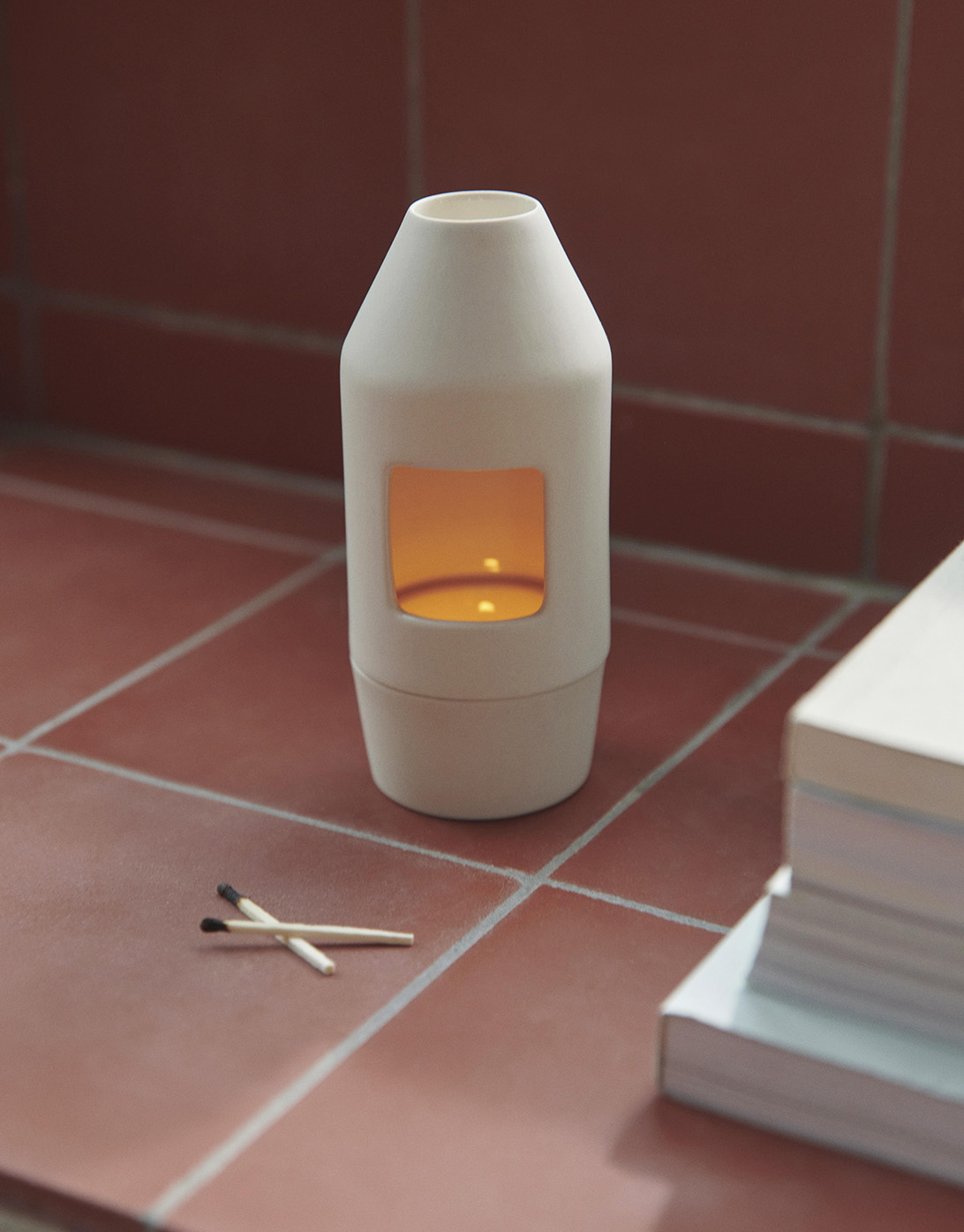
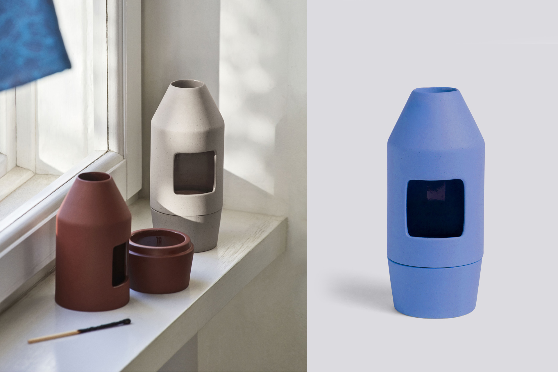
15.04.2024 / CHIM CHIM scent diffuser, designed in collaboration with Ryosuke Fukusada for Danish brand for HAY now availabe in two new colors.
Find more at CHIM CHIM COLOUR UPDATE
15.02.2024 / Launch of BARRO Collection designed for Danish brand HAY
Q & A What was the inspiration behind this piece?
Barro, which means red clay in Portuguese, was the starting point for this tableware range. I have always had a strong interest in the wide spread use of terracotta in the Mediterranean. Being Portuguese, this material is part of my memory and daily life for as far as I can remember. These warm and simple objects can be found in street markets, restaurants and homes all across Portugal, a material for everybody, passed on from generation to generation. This project is part of an ongoing research to unveil the essence of something I know so well and translate it into products that can promote a simpler way of living, closer to matter and nature.
What is the purpose and special features that makes these pieces unique?
The rolled edge detail which frames plates, bowls and trays, is the guiding thread of this collection.
Its soft touch and proportions relate to the human finger tips, aiming to offer a pleasant articulation with user´s hand, consequently giving a sense of stability and control. This detail was similarly developed for the oven trays, where a proper grip is always appreciated. Normally solved with two handles with a prescribed direction, the rolled edge facilitates its handling in 360 degrees. It felt only natural to apply this same principle to the full range. This same edge detail also allows plates and bowls to stack in a precise way.
How would you describe the aesthetic of this collection?
The functional yet simple silhouettes cover most of the usual needs a tableware collection should respond to. Its neutrality allows for mix and matching with any of the items one loves, creating a multitude of table scenarios adaptable to any style.
How is sustainability factored into this collection?
Together with the pottery, a special kind of terracotta was developed to ensure a more durable paste, suited for today´s use, with minimum water absorption and good impact resistance. This harder material, combined with the designed profiles, allowed us to work with thinner thicknesses, consequentially using less material and creating lighter pieces.
Traditional, terracotta pieces passed from generation to generation, carrying along dents and cracks, embedding these objects with rich and fascinating stories.
Can you tell us a bit about how colour is used collection?
The six high-gloss glazed colors featured in this collection: Green, Dark Blue, Light Blue, Pink, Off white and Natural Clay, were selected and calibrated to be combined indefinitely. As an invite to create a customized tablescape, not all items are available in all colors, making space for one’s sensibility.
Can you discuss the production process?
Traditionally, terracotta production is a highly handmade process, requiring the potter years of experience before mastering its craft. For this collection, we have worked with semi-industrial pottery, where the different items have been produced using slip casting and roller pressing. After molding, the pieces still require hand finishing and glazing before being fired. These industrialized processes ensure a more streamed line production, less susceptible to the potter´s interpretation and skill, and truthful to the intended design.
How does this piece fit into HAY’s design universe?
Barro collection goal was to create a functional tableware range at an affordable price with a strong material appeal and versatility. Given terracotta ware´s democratic and functional history, HAY felt like the right outlet for this collection. Barro can easily live side by side with other items in HAY´s accessories range, supporting its tableware products, suited for both indoor and outdoor use.
Find more at BARRO COLLECTION

12.02.2022 / CHIM CHIM scent diffuser part of ‘ Living With Scents’ Exhibiton at MCD San Francisco curated by Elisabetta Pisu and Clara Muller.
On display from February 12-June 5, 2022.
Image courtesy of Henrik Kam.

26.03.2021 / Launch of REMINDER poster series for danish brand FRAMEWORKS
Q & A
You are genuinely a cosmopolitan; born in Portugal, and you have lived in Spain and Italy for a few years, now living in Copenhagen, and collaborating with people worldwide. Do you embrace the term cosmopolitan?I have been calling myself a nomad, someone that settles for a period of time in one place to fulfil a need, and moves on to the next location when time is right, but cosmopolitan is perhaps a more accurate term to define my lifestyle.Having lived in different countries and interacting with other ways of thinking and doing changed my perspective and position about the design discipline. It led me to a general impression that the design is strongest when in close dialogue with the industry.
While being a citizen of the world, much of your work takes inspiration from your Portuguese roots. What do those roots mean to you? After living and working abroad for almost 14 years now, my vision of homeland is getting more and more idealized, and all the things I find unique about being Portuguese are presented to me in an almost caricatural way.I've always been fascinated by craftsmanship and the empiric knowledge passed on from generation to generation. I'm interested in applying this heritage into relevant products for today's ways of living.Even if I tend to impregnate my work with elements from my cultural background, I am also very much open to what surrounds me and people I meet along the way.A good example is my long term collaboration with Ryosuke Fukusada, a Japanese product designer I met while working at Patricia Urquiola studio in Milan. When designing at four hands, we engage with our differences and try to approach things from a different perspective.
Your collection for Frameworks Gallery, and also your work in general, are very colourful. What do solid and vivid colours mean to you?
Our perception of colour is very much connected to light and it's also a very personal matter, which can affect one's mood. In my work, colour and material selection is an integral part of each project, a tool to communicate a certain emotion or attitude.Since I moved to Copenhagen, and due to the lack of light, I see a tendency to use stronger colours to compensate for it.
You work and live in and of the furniture and design industry. Yet you also take time to reflect and raise critical questions about the industry in general and our consumption level. Will an increased awareness among consumers change our path, or are we just doomed? In my practice, and when developing a new project, I often aim to highlight or work with a topic related to our times and which affects our lives. Some projects end up being merely speculations about a hypothetical solution, where design is used as a vehicle of communication, instead of a tool to deliver a finished product. This 'Critical position' stands for a nonconformist approach to the discipline, which often works in favour of corporate growth instead of the final user's interest. It will require an extra effort from political entities and corporations to redirect citizens' consumption patterns into taking more responsible decisions, consequently adjusting to a new lifestyle. If economical interests are put aside and focus is placed on implementing change today, we might be able to extend our collective welfare for generations to come
You have a fondness for red clay. Is that founded in your Portuguese roots, and what does the red clay represent to you?
Red clay tableware is very much connected to Portugal's gastronomic landscape and festivities. It can be found in the most typical restaurants called 'Tasco' and street markets across the country.It's often seen as a less noble material, but to me, besides the immediate link to my homeland, it represents a simpler, more grounded way of living.
You obviously have a solid graphic sense but have (as far as we know) not worked with artworks like this before. Any new learnings or reflections upon creating this collection?
In the past, I often created postcards or other graphical material to communicate a new product, but it is indeed the first time I explore the potentialities of a 2D medium in this scale. Graphic design allows for a very satisfying and freer way of working, when compared to the multiple constraints involved in the three-dimensional physical object design.In a very digitalized world, there is something reassuring about working on a more permanent format, which will hopefully hang on the wall for years, giving the viewer some food for thought.
And finally, tell us a little about the collection you have made?
For this first collection I took a step back and looked at some of the projects I've been working on for the past years.I have approached this project as an opportunity to further develop and extend some of the concepts and subjects I'm interested in and explore their translation in another media.
03.09.2020 / ANZA collection on display at PLEASE WAIT to be SEATED Copenhagen’s showroom during 3 days of design.
03.08.2020 / Chim Chim 2.0 launched with Danish brand HAY.
01.07.2020 / New brand identity designed in collaboration with AO-N Studio.